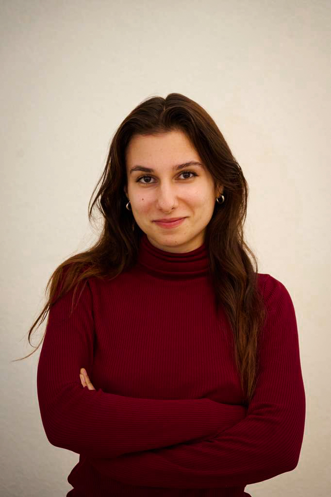
Graphic Designer since 2021 · Berlin, DE Open to roles EU citizen · no visa needed

I design brand systems and I keep running them after they launch.

Identity, editorial, packaging and social, drawn and specified. I run by Faye, my own studio, and design social media for US real estate agents. I did the founding identity for NOIL, a new media platform, and I design for Greasy Fingers in Kreuzberg. I also shoot photography, and I write and cut short films.

Faye Papadopoulos
Faye Papadopoulos Graphic Designer
Berlin, DE
NowFounder & designer, by FayeMy own studio · Berlin, clients in the US
Right to workEU citizenNo visa or sponsorship needed
EducationBA (Hons) Graphic DesignFlorence Institute of Design, 2024
Looking forA full-time or part-time roleRemote preferred · or in person in Berlin
LanguagesEnglish & Spanish, fluentGerman B1, in intensive courses
ToolsAdobe Suite · InDesign · Illustrator · Photoshop · After Effects · Figma · Procreate · Claude Code · Notion · Microsoft Office

01 / Selected work

08 projects
01

by Faye — my studio

Studio brand + client work · Berlin, working with the US · 2026 — ongoing
● Live & running

by Faye is my studio. I design and run social media for real estate agents in the US, and I do it from Berlin.

What I am competing with is a Canva flyer, because most agent feeds are crowded template graphics. So the brand is built to be the opposite of one. Fraunces set large on blush and plum with a rose accent, Jost underneath it, one idea per frame and enough room around it to read like a magazine page. I stayed off the navy and grey that every real estate brand uses, because I am selling design to agents rather than houses to buyers.

An agent decides whether to hire me by looking at my feed, which makes the account the portfolio. It had to be finished and running before I asked anyone to pay for it.

My first client is Elias Papadopoulos, a RE/MAX broker who has been selling in Greater Boston since 1985 and had almost nothing online. I did the market audit and the audience research, and I built his brand kit, his landing page and his lead capture. Posts and captions are produced inside that system with AI, and I direct it and edit what comes back. I keep the calendar, I post everything to his account myself, and I only take a post to him when I am unsure of a real estate detail.

The blue and the red are RE/MAX’s own colours, and he is a RE/MAX broker who likes the classic version of it. So the palette came with the franchise and I built the rest around it: a hard grid, and type that reads the same way on a sold post as it does on a neighbourhood guide. That is the opposite of my own brand, where nothing was fixed and every choice was mine to argue for. He has forty years of credibility and it had to survive being looked at on a phone.

Role
Founder · designer · strategist · copywriter
Studio
Identity, brand kit, template system, voice & tone, service design, site
Client
Brand kit, post and carousel system, stories, highlights, landing page, PDF guide, launch email
Status
Studio live; first client launched from zero and retained
The studio brand — Fraunces on blush and plum, one idea per frame
The client — Elias Papadopoulos, RE/MAX broker, Greater Boston
The landing pages — I built and shipped both, and both are live
02

NOIL

Founding identity & brand manual · Italy · 2025 —
Lead designer

NOIL stands for No One is Listening. It is a new media platform that connects people across cultures through voice, and it works in three places: on the page, on the screen, and in the world. The events so far, a Night of Authentic Voice, a run of Power of Listening workshops, and a live reading of the founder’s memoir essay, have drawn 50+ people from 5+ countries.

The primary logo is the full name typed out and then struck through with a single blue line. The name is the problem the platform exists to solve, so crossing it out is the argument. Two stacked NOIL marks handle tight spaces, each drawn in print black and in paper white, and the manual is explicit that the short mark never stands in for the long one unless the space demands it.

Three typefaces carry the whole thing. F25 Executive is held back for the logo and for headings that belong to NOIL, Franklin Gothic Book does the body because it reads as a human voice rather than a house style, and Libre Bodoni takes the quotations. Under that sits one rule about contrast: anything typed can be answered by something drawn. Headings get underlined with a hand stroke, and the lettering runs across the covers and the article layouts.

The palette is paper white, print black and a sky blue, with blush pink and golden yellow behind them, chosen to read as curiosity and openness rather than authority. NOIL wanted bright colour as resistance to what I call the greige takeover of design. I wrote and designed the whole manual, and since NOIL has no designer in house it had to settle questions I would not be there for. Arianna Bambagioni worked with me on some of the design components.

Client
NOIL (No One is Listening), a new media platform
Reach
50+ people from 5+ countries across three events
Type
F25 Executive, Franklin Gothic Book, Libre Bodoni
Palette
Paper white, print black, sky blue; blush pink and golden yellow behind them
Role
Lead designer · wrote and designed the brand manual
With
Arianna Bambagioni on some design components
Shipped
Logo and variations, brand manual, lettering, article templates, digital assets
The manual — logo variations, audience, imagery rules and the article template
Lettering and application — the hand-lettered name, and the identity on mobile
03

Lumina Bio Cosmetics

University brief · rebrand for Relax Firenze · Florence · 2023
University project

Relax Firenze is a wellness centre in the middle of Florence with a skincare line under the same name. It sold in person, by word of mouth, mostly to women over 35. Five product lines were told apart by small symbols on identical glass bottles, so from across a shop the whole range looked like one product. The brief was to rebrand it, widen the age range, reach men, and put sustainability ahead of everything else.

The five lines already existed, under names that did not say what any of them were for: Pura, Donnaluna, Orobianco, Corpo d’Amore and Lui. I named the brand Lumina, from the Latin for light: lume in Italian, luminosa in Spanish, luminous in English, and in Arabic, of the glowing light of the moon. Then I renamed the lines after things in the sky, Celeste, Luna, Sol, Stelle and Eclipse, and each one keeps what it was originally for. Every one of them either gives light or is lit by it, so the range finally has one idea holding it together.

The mark is that word inside a circle, and the horizontal bar of the L is a golden light that cuts across and completes the word. I drew the circle uneven so it reads as water and movement instead of as a perfect ring. Type is Josefin Sans in three weights with Cherolina on the logo, and neither face is perfectly symmetrical, which is the same decision as the circle.

Each line got a colour and an age. Celeste is the palest blue and sells to women 18 to 30, Sol is for men over 25, and Eclipse is a deep oxblood for anyone over 35, which is where the brief to widen the range and reach men actually gets answered. The colours come out of the wellness centre’s own vocabulary rather than out of cosmetics, so blue is there because the body is mostly water, green for the earth, oxblood for maturity, gold for the elixir of life. Running through every label is one stroke of white gold, #eede76, and it is the only thing all five share, which is what makes the shelf read as one house.

Sustainability had to be visible rather than claimed. The boxes are 100% plantable paper printed on the inside as well as the outside, so the panel carrying the ingredient copy can go in the ground once the bottle is open. The two faces do different jobs: the outside argues the case for buying sustainable skincare at all, and the inside is ingredients and hand-drawn botanicals. Bottles and jars are Estal’s Magister line in 100% recycled glass, and customers bring the empties back to the centre to be refilled. Bottles get a wooden dropper, jars get a white cap, and the cotton bag carries the logo small on the side so people will use it for other things.

Brief
University brief: rebrand Relax Firenze, widen the age range, reach men, sustainability first
Renamed
Pura, Donnaluna, Orobianco, Corpo d’Amore and Lui became Celeste, Luna, Eclipse, Stelle and Sol
Who each is for
Celeste women 18–30 · Luna women 31–70 · Sol men 25+ · Stelle women 25+ · Eclipse 35+, men and women
Palette
Five line colours, #b1c5de through #4a1311, plus white gold #eede76 kept for the light detailing
Type
Josefin Sans in Thin, Extra Light and Light. Cherolina for the logo and for “Naturally made in Italy”
Manual rules
Clearance at a quarter of the circle. Logo from 20 mm to 106 mm. No black logo on anything darker than the Celeste blue. Box copy scientific, six sentences maximum
Materials
Estal Magister recycled glass, plantable paper, wooden dropper, white jar cap, cotton bag
Shipped
Identity, brand manual, packaging, labels, the PLANT ME brochure, social, a promotion plan and a costing down to the €299 Cherolina licence
The manual — the mark, its inversion, and the botanicals I drew for the packaging
The five lines — the sub-brand moodboards from the manual: Celeste, Luna and Sol, Stelle and Eclipse, each with its audience and its focus
Packaging — the Eclipse bottle, the Celeste box, and the box flat, printed both sides on plantable paper
In use — the brochure and the social templates
04

Greasy Fingers

Wordmark, identity & membership · Berlin · 2026 · on hold
Designer

Greasy Fingers is a bike shop and bar on Dresdener Straße in Kreuzberg. A workshop in the daytime, a bar at night. I’m their designer.

The Kiez Mitglied card had to cover both halves of that business on one piece of plastic: unlimited minor repairs, 20% off drinks, 10% off parts and gear. I drew the wordmark by hand, closer to a painted shop sign than a typeface, and set it on a violet that reads one way under workshop lights and another way after dark.

The rest is on hold. Greasy Fingers paused the build while they raise more funding, so the design stopped where the project stopped. The card is what shipped.

Shipped
Wordmark, palette, Kiez Mitglied membership card
Status
Paused with the project, pending further funding
05

Guerillas

BA design research thesis · textbook, app & AR · Florence, 2024
Thesis project

Guerillas was my BA design research thesis at the Florence Institute of Design International. The question was whether deconstructivist design can teach critical analysis, and the only honest way to answer it was to build the thing, so I made a printed history textbook for teenagers and an app that reads it.

What I was arguing against is The American Pageant, one of the most used US history textbooks there is. Long hyphenated paragraphs, tidy graphs, and authors students are never asked to name. Swiss principles, simplicity and a neutral voice and a strict grid, get read as objectivity, which is the last thing a history book should be claiming. The student hands control to the text instead of arguing with it.

So the book argues back. Body text is Candara at 14 and 20 point, and the size shifts to mark what matters and to leave a reader checkpoints to stop at. Display type is a set of punk faces: Carton, Stampede, Heavitas, gutter vomit, and a copperplate called US Declaration. Chapter openers are collage. On the Wyoming suffrage spread the word WHY? is set over and over in a smudged typewriter face, and the repetitions are arranged into question marks that run down the gutter. Every article is signed, down to the university or publication the writer came from, so a student can go and doubt them. That is the skill the book exists to teach.

The app carries the same system onto a screen, across four tabs: home, library, scan and community. There is an audio option so the text can be listened to instead of read. Scan opens the AR layer, built in partnership with Artivive, so a page in the printed book animates when a phone is held over it. I specified all of it for build, with type sizes, weights, hex values and image dimensions on every screen.

Brief
Self-directed BA (Hons) design research thesis, Spring 2024
Question
Can deconstructivist design teach critical analysis in history?
Grounding
Derrida, Of Grammatology (1967); Ellen Lupton on deconstruction and graphic design
Audience
Pre-teens and teenagers, US school history
Type
Candara for body; Carton, Stampede, Heavitas, US Declaration for display; Argent Pixel in the app
Shipped
Textbook, brand manual, app UI & spec deck, AR layer, identity, merch
The manual — five layout types, each with its own rules, then one of them specified in full
The printed book — primary sources tipped in as facsimiles you can lift and handle
The app and the AR — specified for build, with an audio reader and a scan tab that animates the printed page
On one sheet — the book, the app, the AR and the campaign together
06

La Dolce Vita

University brief · illustrated guidebook · Florence · 2022
Wrote it, drew it, set it

La Dolce Vita is a guide to slow living in Florence. I took the Italian idea of the same name, researched what it actually looks like in the city day to day, and wrote the guidebook.

The chapters cover museums, restaurants, nature, walking and home, and there’s a page of Italian phrases worth knowing before you get there. Every illustration is drawn in Procreate. I set the book in InDesign.

The set brief was a guide to Florence. Choosing slow living as the subject is what put a chapter on walking and a chapter on home into a guidebook.

Role
Research, writing, illustration, editorial design
Shipped
A complete guidebook, covers to print
07

GRRRL RUIN

Music design · wordmark and posters for my own band project
Music design

GRRRL RUIN is the music I write and play, and I design it as well. The wordmark is cut from magazine letters. I moved them around by hand until the line sat right, so the tilt and drop of every letter is where I physically put it.

The poster is a recruitment ad, because I needed three or four musicians. I wrote it in the register the ad belongs to instead of the one a design portfolio reaches for, and built the page as a collage of newspaper clippings, old personal ads and a punk documentary sheet. The wordmark breaks in half and pins the two opposite corners.

Designing for music is the work I would most like to be paid for.

Project
My own band · @grrrlruin ↗
Role
Lettering, collage, layout and the copy
Wordmark
Cut from magazines by hand, then digitised
Posters
Two A4: the recruitment page, written and set to read as a classified ad, and the gig poster for Herman Schultz
The wordmark — the finished lockup, cut from magazine letters and digitised
The posters — the ad I ran to find the rest of the band, and the poster for the acoustic show at Herman Schultz in Berlin
08

Realtop Marketing

Social campaigns for agency clients · Boston, MA · 2023
Graphic design intern

Realtop is a marketing agency in Boston, and I was their graphic design intern in 2023. I made social posts for the clients on their roster. The four here are Atlantic Coast Title, KeyCredit Repair, Poli Mortgage and Prime Healthcare.

I worked inside identities that already existed, under the agency’s head graphic designer. Every client arrived with a brand and a set of layouts already built, and the copy came to me written. What I chose was the photograph, how it was cropped, and where the type sat once the supplied line ran longer than the one before it.

The four brands have nothing in common. Atlantic Coast is navy and cyan under condensed italic caps, KeyCredit is a rounded sans that turns into a brush script for a holiday post, Poli splits the frame on a diagonal in two greens, and Prime Healthcare is a high-contrast serif over a white footer. Everywhere else on this page I am the one setting the rules, and here somebody else set them. I can work either way.

Mine
Image choice, cropping, and fitting type into layouts that were already set
Not mine
The brand identities, the layouts and the copy

02 / Film & photography

Film · photography
09

Three short films

University coursework · written, directed, shot and edited · Florence, 2023
Wrote, shot, cut

Videography was my favourite class at university, and these are the three short films I made for it in Florence. I wrote each one, directed it, shot it and edited it.

Lovesick is the longest at 12:42, and the most abstract of the three. It was shot in one room, and I handwrote every letter that appears in it. The whole thing cost under thirty euro. The actress carries the film. I edited the music as well.

Per Sempre runs 8:56. I wrote the script in English and then translated it into Italian, because the performance was more honest in the language it was being acted in. The actors took the translated script and made it sound like their own words. The English runs underneath in yellow, which is the old cinema convention, and it has to stay readable on a dark frame without taking over the shot.

Pose is a conceptual film about self-voyeurism, and at 4:08 it is the shortest of the three. I composed the music for this one.

Brief
University coursework · Florence, 2023
Role
Writing, directing, camera, editing, and the music on Pose
Lovesick
12:42 · one room, every letter handwritten, under €30
Per Sempre
8:56 · written in English, performed in Italian, yellow subtitles
Pose
4:08 · conceptual, on self-voyeurism · music composed by me
Included
Locations, props, wardrobe, titles and sound
Watch
All three play on this page, and on @grrrlruin ↗
The films — click a poster to play it here
Stills — one film per column: Lovesick, Per Sempre, Pose
10

Photography

Directed, street and live music · plus Languages, a photo book
Shot, selected, sequenced

I have shot in every mode I could get to, and the one I keep coming back to is directed and conceptual work. I light it and style it first, then I work with the person in front of the camera until the picture is actually there.

Street asks the opposite of me. I have to be ready and then not hesitate, because the man with the pipe and the woman outside the market each lasted about two seconds. I like shooting concerts too. The light there belongs to somebody else and it changes on every song, so most of that work happens in what I keep afterwards.

Languages is a photo series about the human body as a reflection of nature. I built it as a book rather than a set of prints, because the argument is in the pairing. A mouth is followed by a seed pod that has the same seam, and hair by grass that falls the same way.

Handwritten pages run between the photographs. The sequencing tells the story as much as the pictures do, so the order of the pages took longer to settle than any single frame took to shoot.

Modes
Directed, street and live music
Series
Languages · a photo book pairing the human body with natural forms
Role
Shooting, selection, sequencing and the book layout
Live
Tenderheds at The Lansdowne, May 2024
Street
Available light, no setup
Directed — everything here was set up and lit
Street — four frames, all in available light
Live music — Tenderheds at The Lansdowne, May 2024
Languages — conceptual photography. We are one and the same.

03 / Info

Berlin, DE

I live in Berlin. I make brand systems and then I keep running them.

I have a BA (Hons) in Graphic Design from the Florence Institute of Design. I run by Faye, my own studio, with clients in the US. I did the founding identity for NOIL, a new media platform in Italy, and I’m the designer for Greasy Fingers here in Berlin.

My parents are Greek and Mexican and I grew up switching languages at home, so I got early practice at saying one thing three ways and keeping it intact. That is the skill I use on brand systems, where a mark, a headline and a caption all have to hold the same idea in different formats. I speak English and Spanish fluently, I’m at B1 in German and taking intensive courses.

I also write, direct, shoot and edit short films, and I shoot street, directed and product photography. It is the same job as the design work in a different medium, and it means I can shoot and cut something as well as design it. On my own films I do all of it, from the script to the final cut, which is why a design job that also needs a camera is one I can take.

What I can take on

Graphic design and art direction. Brand and campaign work. Photography and short-form video, which I can shoot and edit myself. Identity and campaign work for music and film. Marketing, content strategy and copywriting. Social media management. I’ve also done reception, scheduling and bookkeeping alongside design jobs.

Tools

InDesign · Illustrator · Photoshop · After Effects · Figma · Claude Code · AI tooling · print production · brand systems · illustration · photography · content strategy

2026 —Founder & Designerby Faye · Berlin, clients in the US
2026 —Lead Graphic DesignerHandlebar / Greasy Fingers · Berlin
2025 —Lead Graphic DesignerNOIL · Italy (remote)
2024–25Graphic Designer & ReceptionGenerator Alexanderplatz · Berlin
2023Graphic Design InternRealtop Marketing · Boston, MA
2021–23Graphic Designer & ReceptionRe/MAX Unlimited · Boston, MA
2021–22Social Media Lead, volunteerLucy Parsons Center · Boston, MA
2024BA (Hons) Graphic DesignChester University via Florence Institute of Design